Incorporating Pantone’s Colour of the Year – Greenery
Since 2000, Pantone has researched and released a new colour that represents visual design trends across a number of industries such as fashion and interior design. Highlighting the next big thing in terms of colour palettes for both your wardrobe and your home, Pantone have been an influential figure in releasing interesting shades for everyone to incorporate and enjoy as they see fit.
In 2017, Pantone released an intriguing new colour trend which has split people down the middle, thanks to its rather vibrant appearance. So, if you’re looking to transform your interior design this year, this might be the shade you’ve been searching for.
Introducing Greenery from Pantone
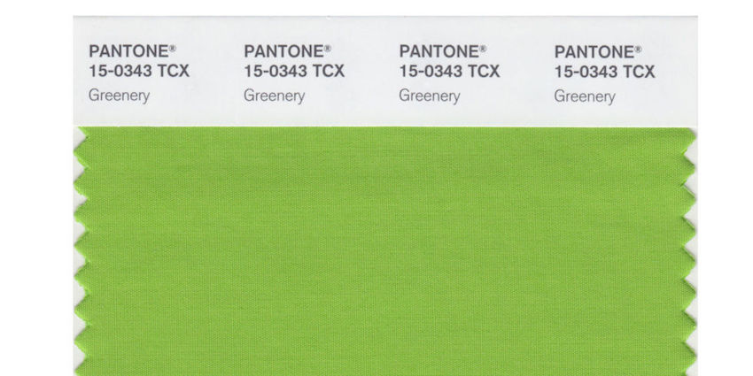
The new shade from Pantone, aptly named Greenery, is said to be a symbol of nature. Embodying the concept of new beginnings, Greenery is described as a fresh yellow-green that is reminiscent of the first days of spring.
Green has long been a colour suggestive of nature, but this particular shade is described as ‘illustrative of flourishing foliage’, evoking a sense of the lush outdoors. An incredibly versatile colour, Greenery is a trans-seasonal shade that works with many different combinations across the colour spectrum.
Using Greenery in Fashion
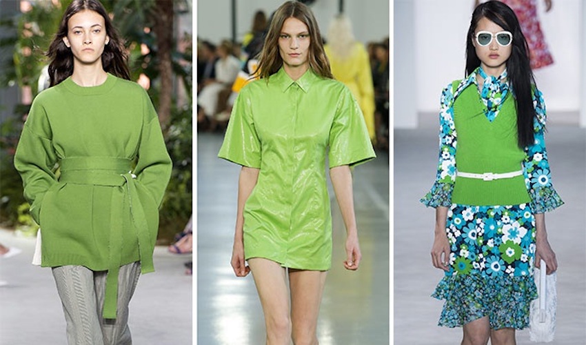
Many colour trends work across both the fashion industry and interior design; what is popular on the catwalks will often cross over into our homes. As new colours emerge, trends begin to form and become popular in certain aspects of our lifestyle. Green has been a popular way of adding a splash of colour in recent months, whether it’s to brighten up an otherwise neutral room or simply to make our wardrobe that little bit more exciting.
The now popular Greenery shade has already been spotted in catwalk shows from the likes of Emilio Pucci and Michael Kors, solidifying it as a top colour for the season ahead.

How to use Greenery in your Home
Pantone has paired Greenery with 10 different colour palettes, enabling even the most sceptical of readers to incorporate it into their homes in some way. From neutrals to metallics, Greenery can be combined with a number of other shades, allowing it to blend in seamlessly.
While green isn’t often thought of as a popular colour for interior design, it can introduce an earthly, comforting feel to your rooms. Whether you’re looking to go bold, or do something a little subtler, you have the chance to experiment and change your style in line with the new trend.
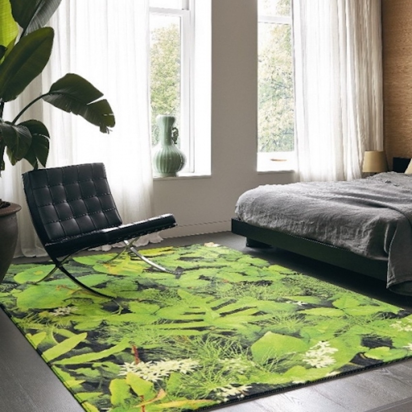
If you cast your mind back to previous trends that may already have a place in your home, such as copper and marble, it’s easy to see how Greenery can fit into your existing décor. One such way of including new colour into your home is through a coloured rug. Green rugs can introduce a natural approach to your interior design without having to overhaul your entire décor in one go.

So, when it comes to looking for new colours for your interior design this year, be bold and choose something a little different!
Written by David Milsont. David is an avid writer who loves to write on lifestyle, health, fashion, travel and more.
*****
You can find The Life of Stuff on Facebook, Twitter and Instagram but don’t forget ↓


